The FLUENT Series
POSTER DESIGNS BY HABIB PATEL
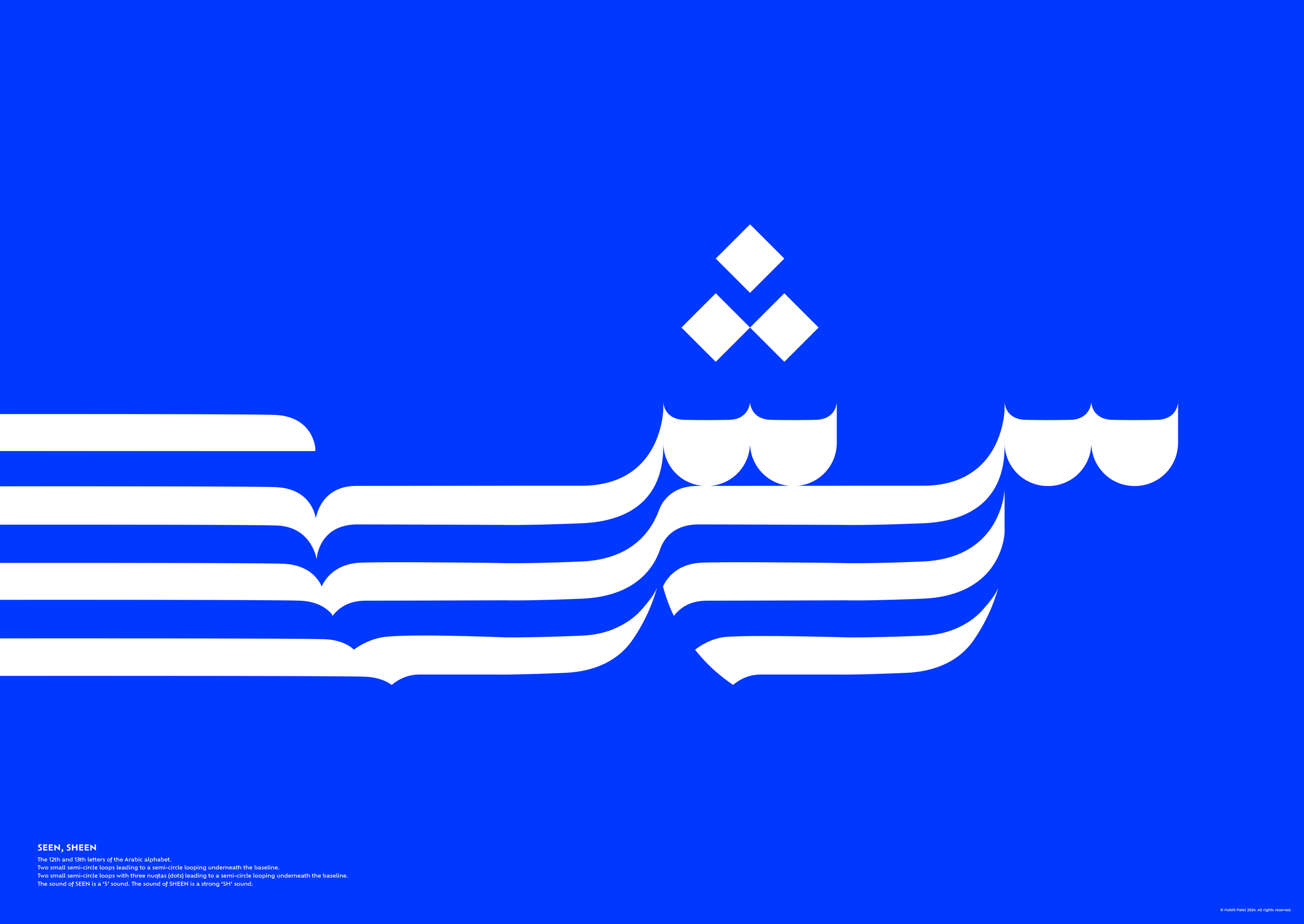
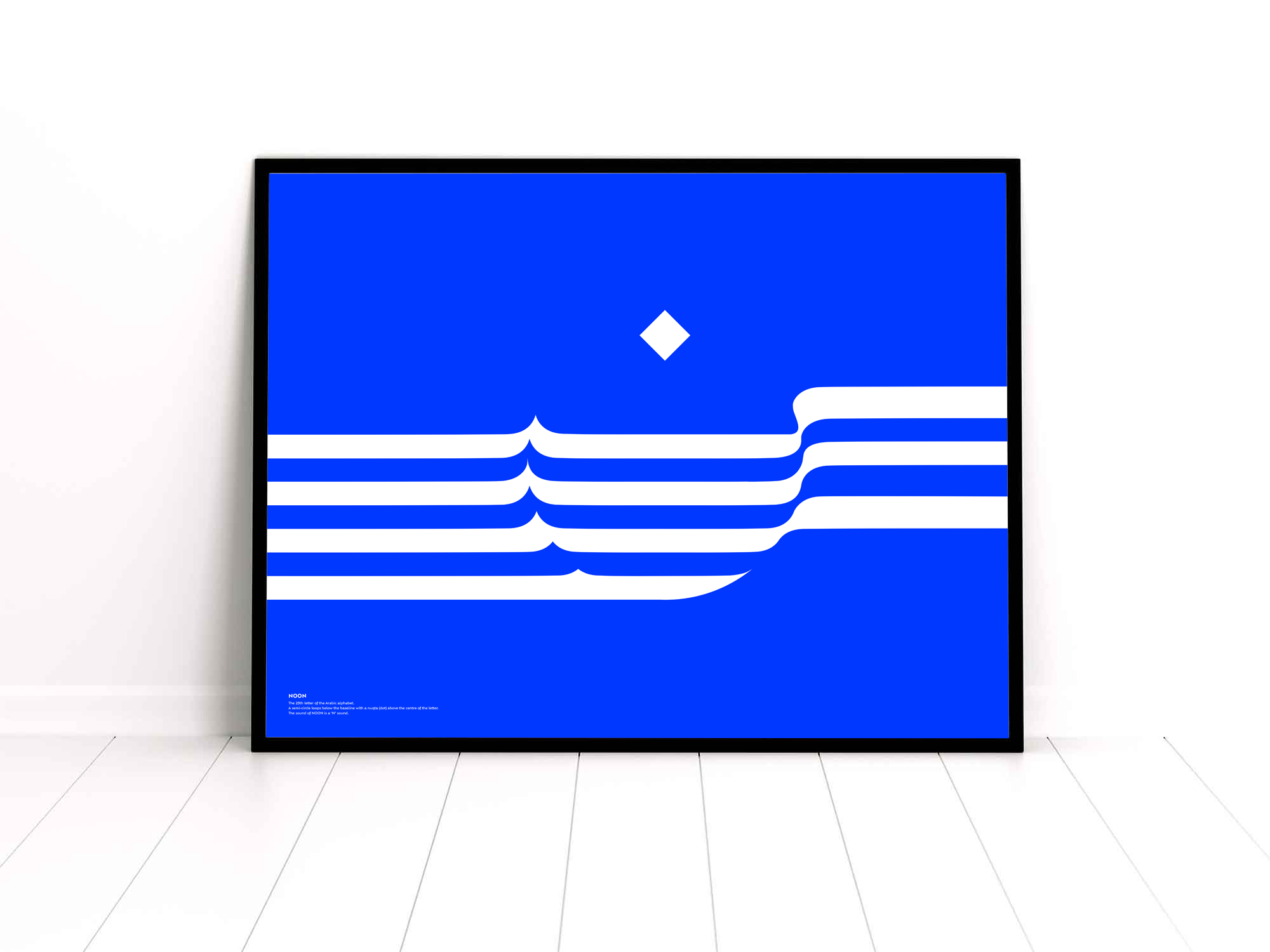
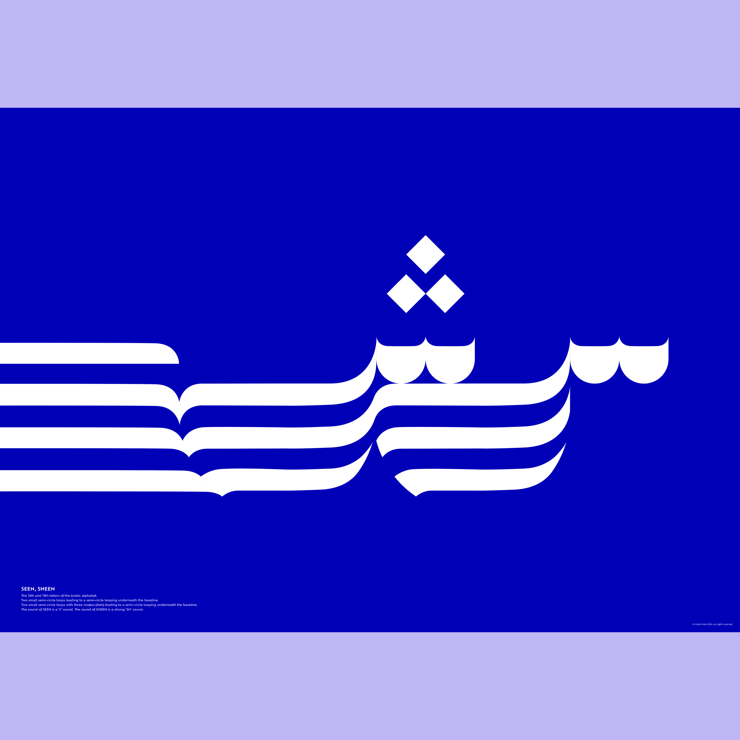
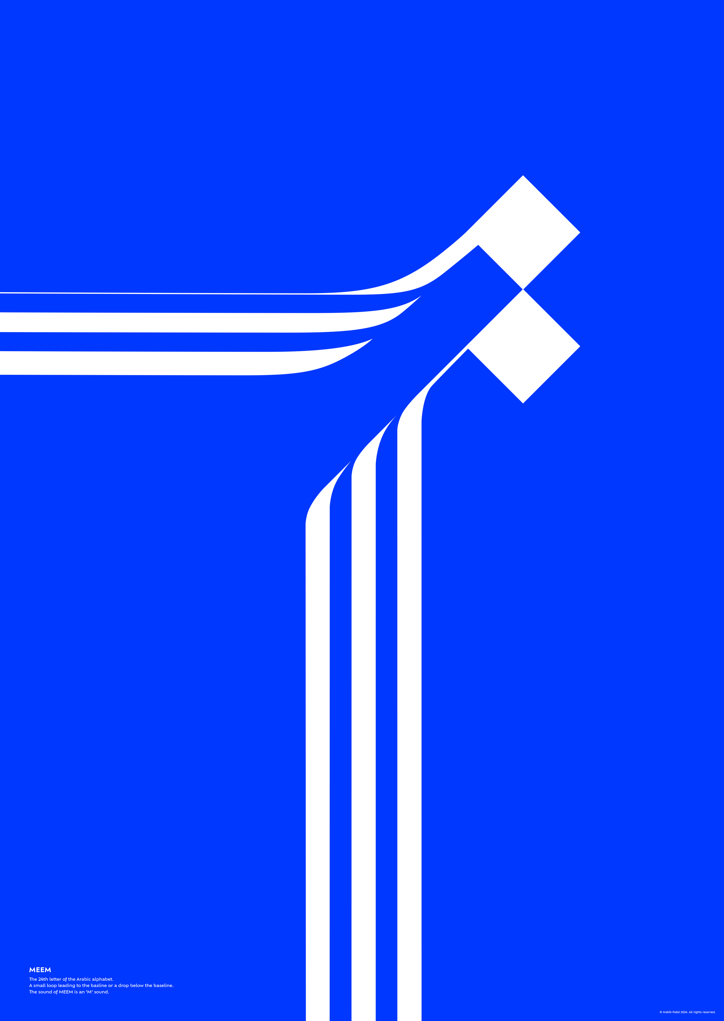
The FLUENT series of poster designs, part typographic, part pure expression, attempt to capture the fascination Habib Patel has had with Arabic letterforms throughout his life.
Habib Patel has been writing and drawing Arabic letterforms since his early years growing up in the north of England. He is Muslim by faith and whilst being instructed in Islam in his early years he was introduced to Arabic through the Quraan. He learned how to recite the Quraan and to read and speak Urdu, a language from Pakistan and India that uses Arabic letterforms, cementing his connection to the beauty of the lettering.
Those early years forged a fascination with how Arabic letterforms worked. The continuous nature of the baseline and the flexibility of the lettering became clear whilst completing homework tasks in Urdu. It was then that he grew to love the fluidity, the flexibility and the organic nature of the Arabic letterform.
This series celebrates these qualities. Each letter is treated as a typographic form and seeks to elevate the fluent nature within each letterform. Some designs are a pair or a trio of letters, as the forms of these letters are intrinsically related. This echoing of forms serves to highlight the additional genius and efficiency of the Arabic lettering system. The blue colour used for this series is drawn from the rich blues prevalent in Islamic architecture and art all over the world.


